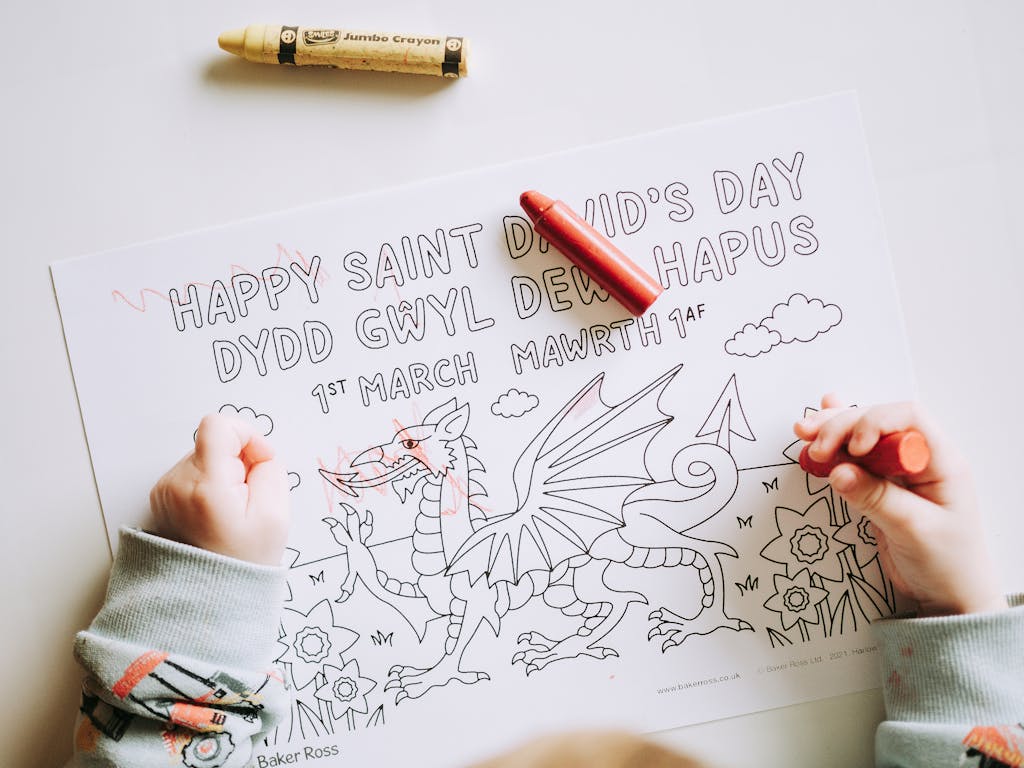
How to Bring Your Coloring Pages to Life with Textures
There’s nothing wrong with flat, vibrant coloring, it’s fun, it’s easy, and it looks great. But if you’ve ever stared at your finished page and thought, This could use a little something extra, then it’s time to talk about textures.
Textures can take your coloring pages from “that’s nice” to “whoa, that looks real!” Adding texture is about creating depth, personality, and an extra layer of creativity that brings your designs to life.
. This guide is packed with tips, techniques, and insider tricks to help you master the art of adding texture to your coloring pages.
Why Texture Matters
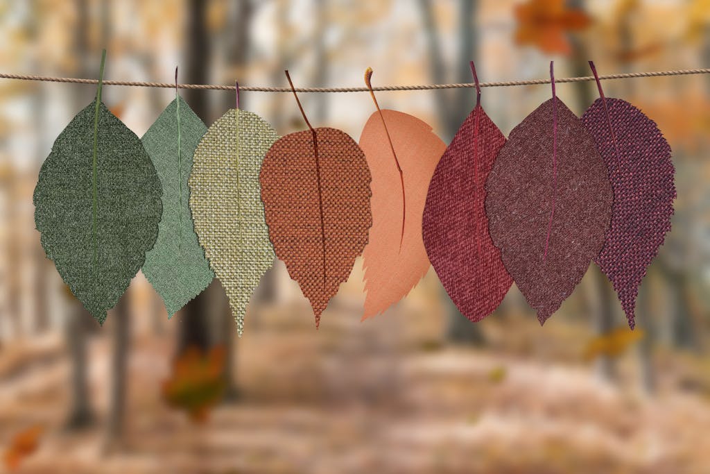
Textures are what make the real world feel… real. Think about the soft fluff of a cloud, the rough bark of a tree, or the smooth gleam of glass. When you add textures to your coloring pages, you’re creating a more dynamic, lifelike effect that makes your work stand out.
Here’s why you’ll love working with textures:
- Adds Depth: Texture makes flat designs look 3D and lifelike.
- Enhances Details: It brings out the finer points of your coloring page, like fur on an animal or veins on a leaf.
- Boosts Creativity: Experimenting with textures opens up endless possibilities for personalization and fun.
Why Texture Matters
Textures are what make the real world feel… real. Think about the soft fluff of a cloud, the rough bark of a tree, or the smooth gleam of glass. When you add textures to your coloring pages, you’re creating a more dynamic, lifelike effect that makes your work stand out.
Here’s why you’ll love working with textures:
Adds Depth: Texture makes flat designs look 3D and lifelike.
Enhances Details: It brings out the finer points of your coloring page, like fur on an animal or veins on a leaf.
Boosts Creativity: Experimenting with textures opens up endless possibilities for personalization and fun.
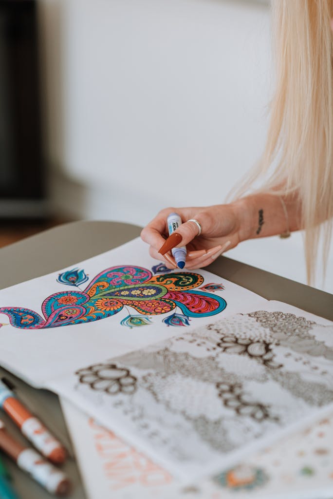
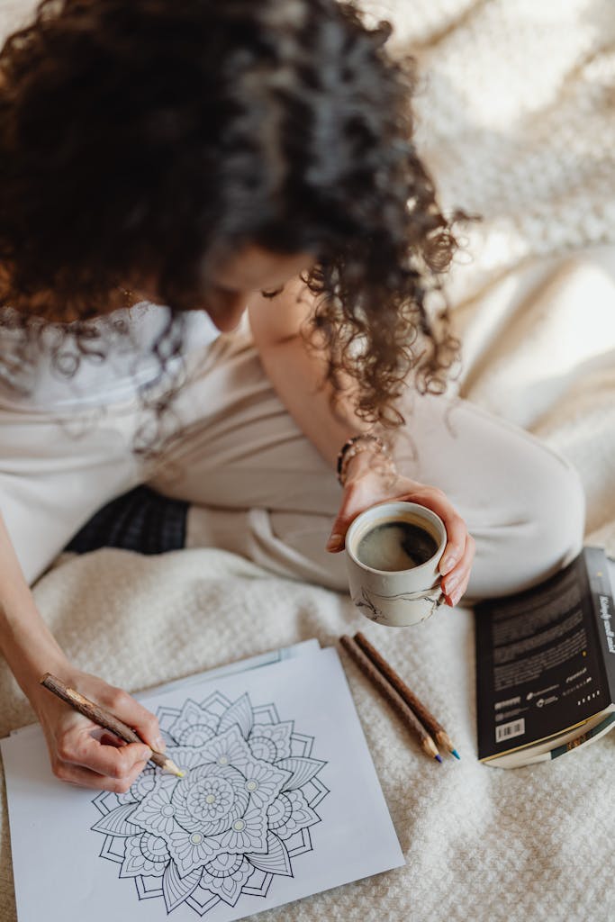
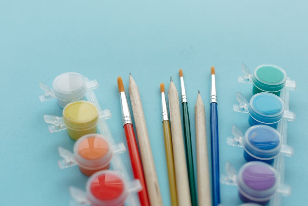
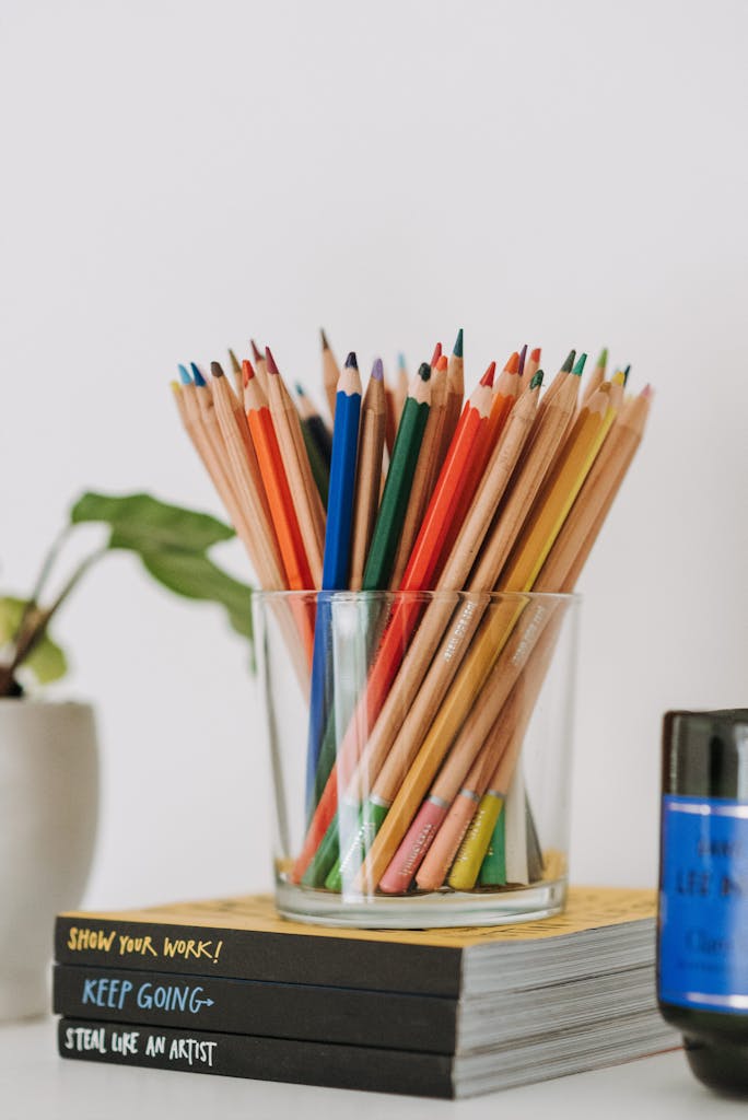
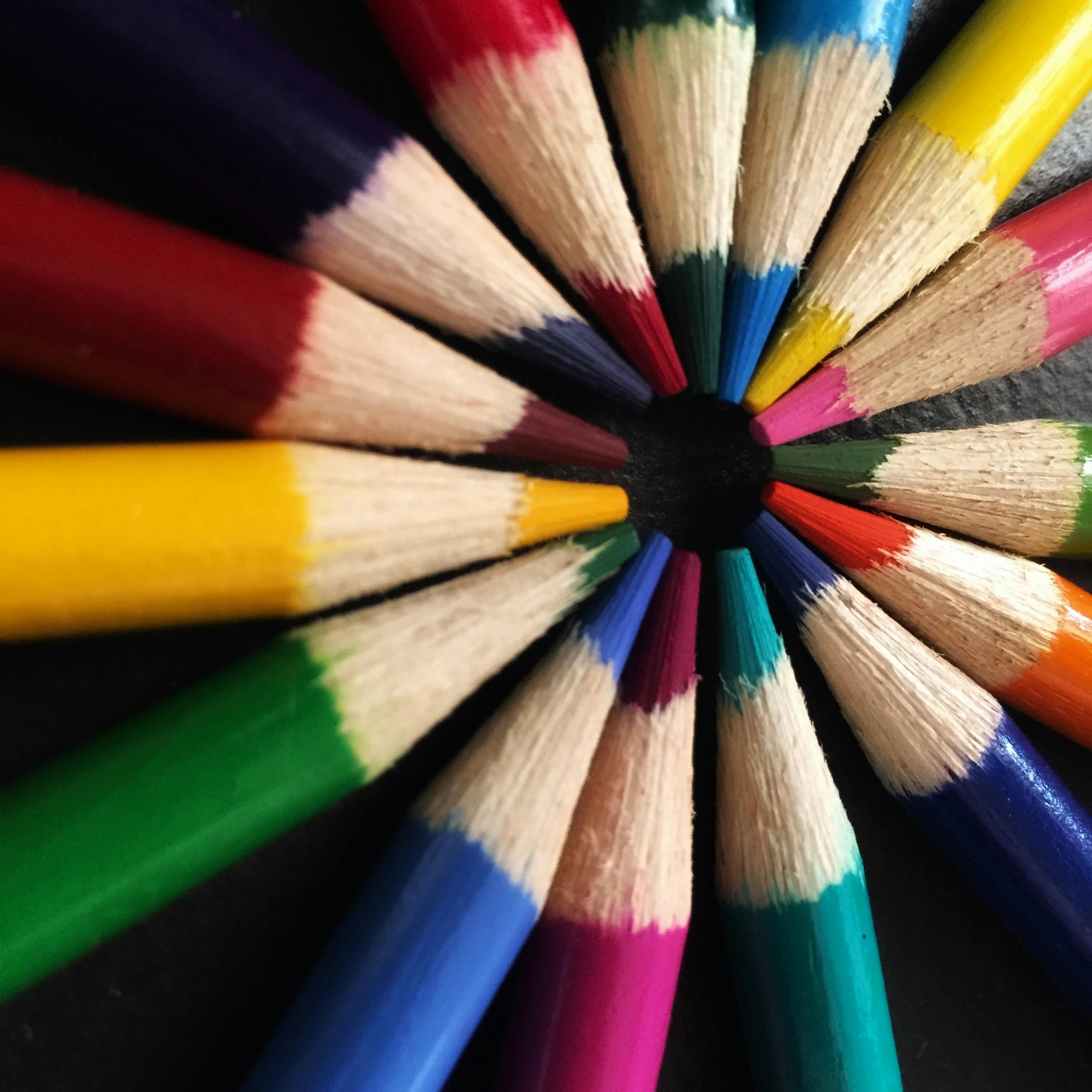
Tools You’ll Need
Before we jump into the techniques, let’s make sure your toolkit is ready. The good news? You probably already have most of these supplies:
Colored Pencils: Ideal for layering and creating fine details.
Markers: Perfect for bold, vibrant textures.
Blending Tools: Blending stumps, cotton swabs, or even your fingers work great for softening textures.
Eraser: A kneaded eraser helps lift pigment for lighter textures.
Gel Pens: Great for adding shiny or raised textures like metallics.
Textured Items: Things like fabric, mesh, or leaves can be used to imprint patterns onto your page.
Sharpener: Keep your pencils sharp for crisp, clean details.
Pro Tip: Always test your tools and techniques on a scrap piece of paper before applying them to your actual coloring page.
Texture Techniques to Bring Your Pages to Life
Now that you’re armed and ready, let’s talk about how to create different textures. These techniques are beginner-friendly but can be adapted for more advanced results as you get comfortable.
Crosshatching for Rough or Woven Textures
Crosshatching is one of the easiest ways to add texture. It’s perfect for rough surfaces like stone, fabric, or even animal fur.
How to Do It:
Start with light, parallel lines in one direction.
Add a second layer of lines at a slight angle, creating a crisscross pattern.
Use varying pressure to control the intensity of the texture.
Where to Use It:
Stone walls, bricks, or pebbles.
Fabric patterns like burlap or denim.
Animal fur (use shorter lines for fur).
Burnishing for Smooth, Shiny Textures
Burnishing involves pressing hard with a colored pencil to create a smooth, polished effect. This technique is perfect for areas that need to look glossy or reflective.
How to Do It:
Lay down a base layer of color using light pressure.
Gradually increase pressure as you add more layers, blending the colors together.
Finish with heavy pressure to create a smooth, waxy finish.
Where to Use It:
Glass, water, or shiny surfaces.
Metal objects like jewelry or armor.
Fruits like apples or cherries.
Pro Tip: Use a colorless blender pencil to enhance the burnished look.
Stippling for Dotted or Speckled Textures
Stippling is all about adding dots to create texture. The closer the dots, the denser the texture; the farther apart, the lighter the effect.
How to Do It:
Use the tip of a pen or pencil to make small, consistent dots.
Cluster the dots for darker areas, and space them out for lighter areas.
Where to Use It:
Sand, gravel, or dirt.
Animal patterns like freckles or scales.
Natural elements like flowers or clouds.
Imprinting for Realistic Textures
Imprinting involves using textured items to add patterns directly onto your coloring page. This technique works best with soft pencils or crayons.
How to Do It:
Place a textured item (like fabric, leaves, or mesh) underneath your paper.
Color lightly over the surface to pick up the texture.
Where to Use It:
Tree bark, grass, or leaves.
Fabric patterns like lace or mesh.
Backgrounds for an organic, natural feel.
Sgraffito for Layered Textures
Sgraffito is a fancy name for scratching away a top layer to reveal the color underneath. It’s great for creating sharp, dramatic textures.
How to Do It:
Lay down a solid base layer of color.
Cover it with a darker layer.
Use a sharp tool (like a toothpick or craft knife) to gently scratch away the top layer, revealing the color below.
Where to Use It:
Animal fur or feathers.
Scratched metal or worn wood.
Intricate details like veins on leaves.
Blending for Soft, Gradual Textures
Blending is a must for creating soft, natural textures like clouds or skin tones.
How to Do It:
Start with light, overlapping layers of color.
Use a blending tool (like a stump or cotton swab) to smooth out the transitions.
Add more layers as needed for depth.
Where to Use It:
Clouds, skies, or water.
Skin tones or soft fabrics.
Gradual shadows or highlights.
Layering Textures for Advanced Effects
Once you’ve mastered the basics, try combining techniques to create more complex textures. For example:
Combine Crosshatching and Stippling: Perfect for detailed fur or rough surfaces like stone.
Blend and Burnish: Use blending for soft transitions, then burnish specific areas for a glossy finish.
Imprinting with Stippling: Add imprinted patterns, then enhance them with dots for depth.
Pro Tip: Layering takes patience, so don’t rush! Work slowly and build up textures gradually.
Common Texture Mistakes (and How to Avoid Them)
Mistake 1: Overdoing It
The Problem: Adding too many textures can overwhelm the design.
The Fix: Use textures sparingly, focusing on key areas that need emphasis.
Mistake 2: Using the Wrong Tools
The Problem: Dull pencils or wet markers can ruin fine details.
The Fix: Keep your tools sharp and test them before starting.
Mistake 3: Forgetting Light and Shadow
The Problem: Textures look flat without proper shading.
The Fix: Think about where the light is coming from and adjust your textures accordingly.
Bonus Tips for Mastering Textures
Study Real-Life Textures
Take a closer look at the world around you. Notice how textures look in different lighting and environments, and try to replicate those effects in your work.
Practice on Scrap Paper
Before committing to a technique, practice on a spare sheet to perfect your approach.
Use References
If you’re coloring something specific (like an animal or object), look up reference images to guide your texture choices.
Wrapping It Up
Adding textures to your coloring pages is like adding seasoning to a dish—it turns something good into something amazing. Whether you’re going for soft and subtle or bold and dramatic, textures give your work depth, personality, and that extra “wow” factor.
The best part? There’s no one “right” way to do it. Experiment with different techniques, mix and match, and find what works best for you. With a little practice, you’ll be creating lifelike, textured masterpieces in no time.