Seasonal Coloring Themes and Ideas: A Guide for Year-Round Inspiration
I’m a little obsessed with colors and themes, and I have to admit, the changing of the seasons is one of my favorite times for inspiration.
Whether it’s the vibrant reds and oranges of fall or the pastel hues of spring, there’s always something new and exciting to explore when it comes to seasonal coloring themes.
So if you’re like me and love incorporating colors into your creative projects, here’s a guide to help you find year-round inspiration for your designs.
Fall: Warm and Cozy Colors
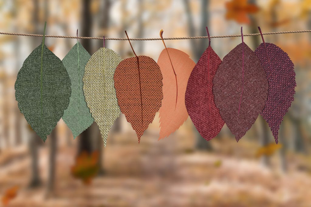
Fall is all about the changing leaves, pumpkin spice everything, and cozy sweaters. So it’s no surprise that the colors of fall are warm and inviting.
Some popular color schemes for this season include:
- Deep reds, oranges, and yellows reminiscent of falling leaves
- Rich browns, greens, and golds inspired by the natural landscape
- Complementary colors like burgundy and mustard for a bold and modern look

As the leaves begin to turn and the air becomes crisp, it’s time to embrace the warm and cozy colors of fall incorporate rich and earthy tones of this season.
Think deep browns, warm oranges, and rich yellows. These colors are perfect for creating a cozy and inviting atmosphere in your home, or for adding a touch of warmth to your wardrobe.
Winter: Cool and Crisp Colors
Winter brings to mind images of snow-covered landscapes, hot cocoa by the fire, and festive holiday decorations. And just like the season itself, winter color themes tend to be cool and crisp.
Some ideas for color schemes during this time of year are:
- Icy blues, silvers, and whites to capture the feel of winter wonderland
- Deep greens, burgundies, and golds for a traditional holiday look
- Pastel pinks and purples for a whimsical touch inspired by the magic of the season
Winter to me feels soft, serene, and quiet. The color palette echoes its characteristics, soft pastels of blue, white, and grey, with a sprinkle of silver to mimic frost and snow.
Spring: Fresh and Bright Colors
After a long, cold winter, spring is a breath of fresh air. As the flowers start to bloom and the weather warms up, our color palettes tend to become more vibrant and lively.
. Spring screams “pastels” , delightful cotton candy hues of blues, pinks, and yellows.
Consider incorporating these colors into your projects for a springtime feel:
- Soft pastels like baby blue, light pink, and mint green
- Bright yellows, oranges, and greens inspired by blooming flowers
- Combinations of complementary colors like lavender and yellow or baby pink and mint green for a playful look
Spring Color Inspirations

Pastel Palettes
Pastel colors are a classic choice for spring, and for good reason.
Soft and delicate, they evoke the blooming flowers and budding trees of the season. Some popular pastel hues include:
- Baby blue
- Pale pink
- Lavender
- Mint green
- Lemon yellow
These colors work well together in a variety of combinations, such as a monochromatic scheme or a pastel rainbow. Consider using pastels for a subtle and sophisticated look.
Nature-Inspired Hues
Another great source of inspiration for spring colors is nature itself.
From bright greens to sunny yellows, the natural world offers a wealth of vibrant and refreshing hues. Some nature-inspired colors to consider include:
- Grass green
- Sky blue
- Buttercup yellow
- Coral pink
- Lilac purple
These colors can be used in a variety of ways, from bold and bright accents to subtle and earthy tones. Consider incorporating them into your spring theme for a fresh and lively look.
Summer: Bold and Fun Colors
Summer is all about fun in the sun, so it’s no surprise that summer color schemes tend to be bold and energetic. This is the perfect time to experiment with bright and playful colors.
Some ideas for summer color schemes include:
- Vibrant shades of blue, yellow, and orange evoking images of the beach and tropical destinations
- Bold and contrasting colors like hot pink and lime green for a bold and modern look
- Warm neutrals like beige and tan paired with pops of coral or turquoise for a laid-back and beachy vibe
Expressing these simmering, vibrant colors in your projects is guaranteed to bring that summer heat and vibe.

Bright and Bold Selections
Summer is the perfect time to experiment with bright and bold colors.
This sub-theme of summer colors includes a wide range of colors, from neon shades to pastels. Some of the most popular bright and bold colors for summer include:
- Coral
- Turquoise
- Yellow
- Fuchsia
- Orange
- Lime green
- Sky blue
These colors are perfect for adding a pop of color to your summer wardrobe.
You can mix and match these colors to create a fun and playful look, or you can use them as accents to add a touch of color to a more subdued outfit.
Nautical and Beach Themes
Nautical and beach themes are another popular sub-theme of summer colors.
These colors are inspired by the ocean, the beach, and everything nautical. Some of the most popular nautical and beach colors for summer include:
- Navy blue
- White
- Red
- Sand
- Seafoam green
- Turquoise
These colors are perfect for creating a relaxed and beachy vibe.
You can use these colors to create a nautical-inspired outfit, or you can use them as accents to add a touch of beachy charm to your summer wardrobe.
No matter what season it is, there’s always a plethora of colors and themes to draw inspiration from. So go ahead and let the changing seasons guide your creativity in new and exciting ways!
Additional Ideas for Year-Round Color Inspiration
- Nature: Take a walk outside and observe the colors around you. From the changing leaves in fall to blooming flowers in spring, nature is always a great source of color inspiration.
- Fashion: Look to fashion trends for color ideas. Designers and brands often release seasonal collections that can provide endless inspiration for your creative projects.
- Holidays and Festivals: Different holidays and festivals throughout the year have specific color palettes associated with them. Incorpor
Seasonal color theory is based on the idea that different colors are more suitable for different seasons.
The right colors can enhance your natural beauty, while the wrong colors can make you look dull and washed out.
The Psychology of Seasonal Colors
The psychology of seasonal colors is based on the idea that certain colors are associated with different moods and emotions.
For example, warm colors like red, orange, and yellow are associated with energy, excitement, and passion.
Cool colors like blue, green, and purple are associated with calmness, relaxation, and tranquility.
In seasonal color theory, the colors of the seasons are chosen based on the emotions and moods that are typically associated with those seasons.
For example, spring colors are light, bright, and playful, while autumn colors are warm, rich, and earthy.
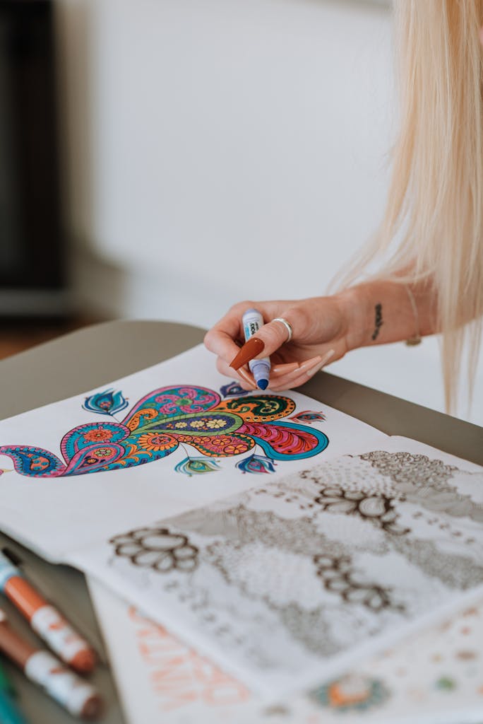
Seasonal Coloring
Seasonal coloring pages are a great way to get into the spirit of each season and holiday.
For example, you could color a pumpkin for Halloween, a turkey for Thanksgiving, or a Christmas tree for the holidays.
These pages are also a fun and educational way to teach children about the different seasons and holidays throughout the year.
Whether you are looking for a relaxing activity to do on a lazy afternoon or a way to celebrate the changing seasons and holidays, seasonal coloring pages are a great option.
Feeling inspired yet? I hope my seasonal color guide fuels your creativity and helps you create beautiful, seasonally-appropriate designs.
Remember to have fun and experiment with different color combinations to find what works best for you.