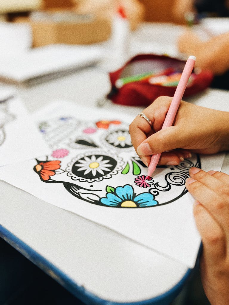
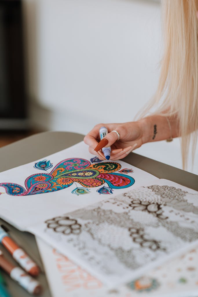
The Best Way to Add Highlights and Shadows to Your Coloring Pages
So, you’ve been coloring for a while, and your pages are looking great but maybe they’re missing that wow factor. You know, the kind of depth and dimension that makes people do a double-take and ask, “Wait, did you really color this?” The secret? Highlights and shadows.
Adding highlights and shadows isn’t just about making your work pop, it’s about creating depth, movement, and life in your art. And while it might sound intimidating, trust me, it’s not rocket science. With a little know-how and some practice, you’ll be adding highlights and shadows like a pro in no time.
This guide is your step-by-step crash course on how to master highlights and shadows for your coloring pages. By the end of this, your pages will go from flat to fabulous. Let’s dive in!

Why Highlights and Shadows Matter
Think about the world around you. Nothing is one flat color there are always lighter and darker areas, depending on where the light hits. Highlights and shadows:
- Add Depth: They make objects look three-dimensional instead of flat.
- Create Focus: Shadows and highlights draw the eye to specific parts of your design.
- Bring Your Page to Life: Realistic lighting makes your art look more dynamic and professional.
Step 1: Understand Light Sources
Before you can add highlights and shadows, you need to figure out where your light is coming from. This is called the light source, and it’s the key to realistic shading.
Common Light Sources:
- Overhead Light: Think of the sun directly above. Shadows fall below objects, and highlights are on top.
- Side Light: Light comes from one side, creating shadows on the opposite side.
- Backlight: Light comes from behind, making the edges of objects glow while the rest is in shadow.
Pro Tip: Draw a tiny sun or lightbulb in the corner of your page to remind yourself where the light is coming from.
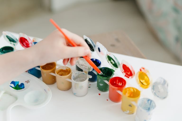
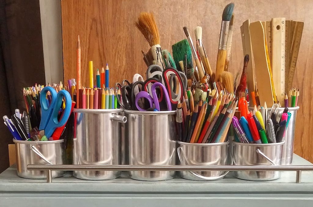
Step 2: Tools You’ll Need
The right tools can make all the difference when adding highlights and shadows. Here’s what you’ll need:
For Highlights:
- White Gel Pen: Perfect for adding small, crisp highlights.
- Eraser: A kneaded eraser is great for lifting color to create subtle highlights.
- White Colored Pencil: Use for soft, blended highlights.
For Shadows:
- Darker Shades of Your Base Color: For realistic shading, use colors from the same family (e.g., dark blue for light blue).
- Black or Gray Pencils: For deep shadows, but use sparingly to avoid harsh lines.
- Blender Pencil or Marker: Helps smooth transitions between light and dark areas.
Step 3: Adding Shadows
Let’s start with shadows. These are the darker areas where light doesn’t hit directly.
How to Add Shadows:
- Identify Shadow Areas: Look at your design and figure out where the light source wouldn’t reach. This might include:
- Underneath objects (e.g., a flower petal).
- The sides opposite your light source.
- Inside folds or creases.
- Start Light: Use a light touch to build up shadow areas gradually. It’s easier to darken later than to lighten up.
- Layer Colors: Start with a slightly darker shade of your base color. Add layers with even darker shades for more depth.
- Blend Smoothly: Use a blender pencil, blending stump, or even a cotton swab to soften the edges of your shadows. This makes them look more natural.
Pro Tip: Avoid using pure black unless you’re working on a very dark design. It can look harsh and unnatural. Instead, layer complementary or analogous colors for depth.
Step 4: Adding Highlights
Highlights are the areas where the light hits directly, making them appear brighter.
How to Add Highlights:
- Identify Highlight Areas: Look for places that are closest to your light source, such as:
- The tops of objects (e.g., the crown of a leaf).
- The edges facing the light.
- Shiny or reflective surfaces like glass or metal.
- Erase for Subtle Highlights: If you’re working with pencils, gently lift color using a kneaded eraser to create a soft highlight.
- Add White for Bold Highlights: Use a white gel pen or pencil to add crisp highlights. This works especially well on shiny objects or wet surfaces like water.
- Blend for a Natural Look: For softer highlights, blend white or light colors into the surrounding areas for a seamless transition.
Pro Tip: Don’t overdo it with white. Too many highlights can make your page look overworked or unrealistic.
Step 5: Combining Highlights and Shadows
Now that you know the basics, it’s time to put them together. This is where your coloring pages truly come to life.
The Process:
- Start with Base Colors: Lay down a flat base layer using your main colors.
- Add Shadows First: Build up your shadows gradually, blending them into the base color.
- Add Highlights Last: Once your shadows are complete, add highlights to the brightest areas for contrast.
- Refine and Blend: Go back and adjust any areas that need more depth or smoother transitions.
Pro Tip: Step back from your page every so often to see how the highlights and shadows look as a whole.
Advanced Highlight and Shadow Techniques
Ready to take your skills to the next level? Try these advanced tips:
1. Gradient Shading
Create smooth transitions between light and dark by using gradient shading. Start with your lightest color and gradually blend into darker shades.
Where to Use It: Skies, fabrics, or rounded objects like spheres.
2. Reflective Highlights
For shiny surfaces like water or glass, add a second set of highlights to mimic reflected light.
How to Do It: Use a white gel pen to add small, sharp highlights opposite your main light source.
3. Cast Shadows
Add shadows around objects to show how they interact with the background.
How to Do It: Use a darker shade of the background color and blend it outward for a soft, realistic shadow.
Common Mistakes (and How to Avoid Them)
Mistake 1: Shadows Are Too Harsh
The Problem: Using black or dark gray for all shadows can make your page look unnatural.
The Fix: Use darker shades of your base colors instead. Blend for a softer look.
Mistake 2: Overusing Highlights
The Problem: Too many highlights can make your design look busy and unrealistic.
The Fix: Limit highlights to areas closest to the light source or to shiny surfaces.
Mistake 3: Ignoring Light Sources
The Problem: Random highlights and shadows make your page look chaotic.
The Fix: Always establish a light source before you start shading.
Practice Makes Perfect
Adding highlights and shadows takes time and practice, so don’t stress if it doesn’t look perfect right away. Start with simple designs and work your way up to more complex ones.
Practice Exercises:
- Shading Spheres: Practice adding highlights and shadows to a simple circle to make it look like a sphere.
- Color Swatches: Test different shadow and highlight combinations on scrap paper to see what works best.
- Study Real-Life Objects: Look at how light interacts with everyday objects and try to replicate it in your coloring.
Wrapping It Up
Adding highlights and shadows to your coloring pages is one of the best ways to level up your art. It’s not about perfection, it’s about experimenting, learning, and having fun.
So, grab your tools, pick a page, and start practicing. With a little patience and creativity, you’ll be amazed at how much depth and dimension you can bring to your coloring.